Figure.1
| PolarSPARC |
Pandas DataFrame Styling
| Bhaskar S | 06/21/2024 |
Overview
A Pandas DataFrame is a 2-dimensional, labeled table-like structure, with rows and columns (just like an Excel sheet), that is extensively used for slicing and dicing of data for analysis.
To highlight the data insights, typically Pandas is used in conjunction with Matplotlib for data visualization. However, a Pandas DataFrame has built-in functionality for styling the DataFrame table in order to highlight the data insights.
In this article, we will get our hands dirty in exploring how one can use the styling capability of the Pandas to make the DataFrame table more presentable.
Installation and Setup
Installation and setup will be on a Linux desktop running Ubuntu 22.04 LTS. Note that the stable Python version on Ubuntu 22.04 is 3.10.
For the demonstration, we will create a Python virtual environment using the venv module. In order to do that, we first need to install the package for venv by executing the following command in a terminal window:
$ sudo apt install python3.10-venv
The Python venv module allows one to create a lightweight virtual environments, each with its own directory structure, that are isolated from the system specific directory structure. To create a Python virtual environment, execute the following command(s) in the terminal window:
$ cd $HOME/Downloads
$ python3 -m venv venv
This will create a directory called venv under the current directory. On needs to activate the newly created virtual environment by executing the following command in the terminal window:
$ source venv/bin/activate
On successful virtual environment activation, the prompt will be prefixed with (venv).
Finally, We will install the required Python modules by executing the following command(s) in the terminal window (with venv activated):
$ pip install jupyter matplotlib pandas
This completes the required installation and setup for the hands-on demonstration.
Hands-on Pandas DataFrame Styling
For the demonstration, we will create the following small dataset called insurance-small.csv that will be located in the directory $HOME/Downloads/data:
age,sex,bmi,children,smoker,region,charges
19,female,27.9,0,yes,southwest,16884.924
28,male,33,3,no,southeast,4449.462
33,male,22.705,0,no,northwest,21984.47061
46,female,33.44,1,no,southeast,8240.5896
37,female,27.74,3,no,northwest,7281.5056
60,female,25.84,0,no,northwest,28923.13692
25,male,26.22,0,no,northeast,2721.3208
62,female,26.29,0,yes,southeast,27808.7251
23,male,,0,no,southwest,1826.843
56,female,39.82,0,no,southeast,11090.7178
27,male,42.13,0,yes,southeast,39611.7577
52,female,30.78,1,no,northeast,10797.3362
23,male,23.845,0,no,northeast,2395.17155
30,male,35.3,0,yes,southwest,36837.467
60,female,,0,no,northeast,13228.84695
37,male,28.025,2,no,northwest,6203.90175
23,male,17.385,1,no,northwest,2775.19215
31,male,36.3,2,yes,southwest,38711
22,male,35.6,0,yes,southwest,35585.576
24,female,26.6,0,no,northeast,3046.062
31,female,36.63,2,no,southeast,4949.7587
We will be using Jupyter Notebook for all our hands-on demonstration.
Open a terminal and ensure we are in the directory $HOME/Downloads and then execute the following command to launch the Jupyter Notebook environment:
jupyter notebook
Note that all the following statements *MUST* be executed in the next notebook code cell.
To import the pandas module, execute the following:
import pandas as pd
To initialize the two variables n_rows and url, execute the following:
n_rows = 10
url = './data/insurance-small.csv'
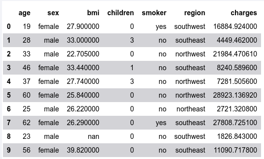
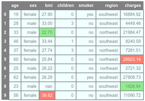
To load our sample dataset into a DataFrame and display the first few rows, execute the following:
df = pd.read_csv(url)
df.head(n_rows)
The following illustration would be the typical output:
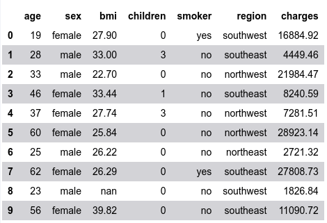
To format the numbers for the columns bmi and charges to two decimal places, execute the following:
df.head(n_rows).style.format({'bmi': '{:.2f}', 'charges': '{:.2f}'})
The following illustration would be the typical output:
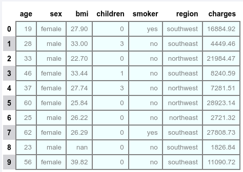
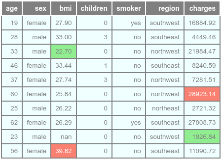
To display borders around the table, change the background color, and the font of the data displayed, execute the following:
df.head(n_rows).style \
  .format({'bmi': '{:.2f}', 'charges': '{:.2f}'}) \
  .set_properties(**{'background-color': 'azure', 'border': '2.0px solid gray', 'color': 'gray', 'font-size': '10pt'})
The following illustration would be the typical output:
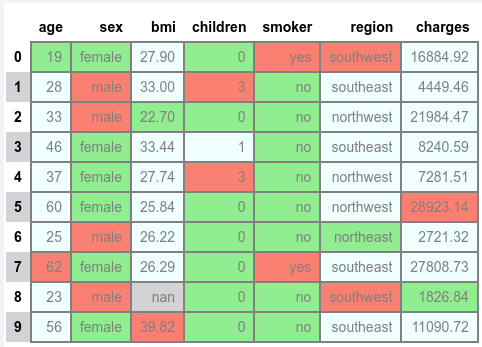
To highlight the minimum, maximum, and null values in each of the columns, execute the following:
df.head(n_rows).style \
  .format({'bmi': '{:.2f}', 'charges': '{:.2f}'}) \
  .set_properties(**{'background-color': 'azure', 'border': '2.0px solid gray', 'color': 'gray'}) \
  .highlight_min() \
  .highlight_max() \
  .highlight_null()
The following illustration would be the typical output:
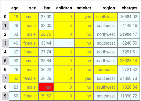
The minimum and maximum values share the same color and hence confusing the visualization !!!
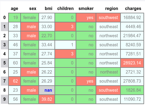
To highlight the minimum, the maximum, and the null values with different background colors for each of the columns, execute the following:
df.head(n_rows).style \
  .format({'bmi': '{:.2f}', 'charges': '{:.2f}'}) \
  .set_properties(**{'background-color': 'azure', 'border': '2.0px solid gray', 'color': 'gray'}) \
  .highlight_min(color='lightgreen') \
  .highlight_max(color='salmon') \
  .highlight_null(color='lightgrey')
The following illustration would be the typical output:
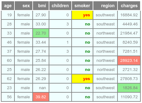
To highlight the minimum, the maximum, and the null values with different background and text colors for each of the columns, execute the following:
df.head(n_rows).style \
  .format({'bmi': '{:.2f}', 'charges': '{:.2f}'}) \
  .set_properties(**{'background-color': 'azure', 'border': '2.0px solid gray', 'color': 'gray'}) \
  .highlight_min(color='lightgreen') \
  .highlight_max(props='background-color: salmon; color: white') \
  .highlight_null(props='background-color: lightgrey; color: blue; font-weight: bold')
The following illustration would be the typical output:
Notice that by default the minimum, the maximum, and the null values are determined for ALL the columns !!!
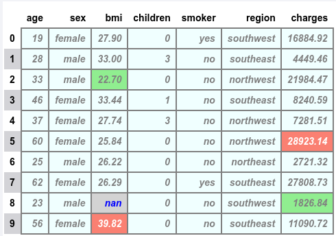
To highlight the minimum, the maximum, and the null values with different background and text colors for specific columns, execute the following:
df.head(n_rows).style \
  .format({'bmi': '{:.2f}', 'charges': '{:.2f}'}) \
  .set_properties(**{'background-color': 'azure', 'border': '2.0px solid gray', 'color': 'gray', 'font-weight': 'bold', 'font-style': 'italic'}) \
  .highlight_min(subset=['bmi', 'charges'], color='lightgreen') \
  .highlight_max(subset=['bmi', 'charges'], props='background-color: salmon; color: white') \
  .highlight_null(subset=['bmi', 'charges'], props='background-color: lightgrey; color: blue; font-weight: bold')
The following illustration would be the typical output:
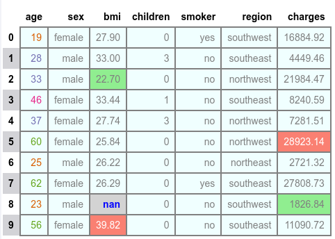
To display the range of number in different text color gradient for the column age, execute the following:
df.head(n_rows).style \
  .format({'bmi': '{:.2f}', 'charges': '{:.2f}'}) \
  .set_properties(**{'background-color': 'azure', 'border': '2.0px solid gray', 'color': 'gray'}) \
  .highlight_min(subset=['bmi', 'charges'], color='lightgreen') \
  .highlight_max(subset=['bmi', 'charges'], props='background-color: salmon; color: white') \
  .highlight_null(subset=['bmi', 'charges'], props='background-color: lightgrey; color: blue; font-weight: bold') \
  .text_gradient(subset=['age'], cmap='Dark2', vmin=1, vmax=100)
The following illustration would be the typical output:
To display row and column labels with a selected background color and text color, execute the following:
df.head(n_rows).style \
  .format({'bmi': '{:.2f}', 'charges': '{:.2f}'}) \
  .set_properties(**{'background-color': 'azure', 'border': '2.0px solid gray', 'color': 'gray'}) \
  .set_table_styles([{'selector': 'th', 'props': [('background-color', 'gray'), ('color', 'white')]}]) \
  .highlight_min(subset=['bmi', 'charges'], color='lightgreen') \
  .highlight_max(subset=['bmi', 'charges'], props='background-color: salmon; color: white')
The following illustration would be the typical output:
Notice that the columns names don't seem to have any kind of separation !!!
To hide the row labels and just display column labels with separation, execute the following:
df.head(n_rows).style \
  .format({'bmi': '{:.2f}', 'charges': '{:.2f}'}) \
  .set_properties(**{'background-color': 'azure', 'border': '2.0px solid gray', 'color': 'gray', 'font-size': '10pt'}) \
  .set_table_styles([{'selector': 'th', 'props': [('background-color', 'gray'), ('color', 'white'), ('border', '2.0px solid white')]}]) \
  .hide() \
  .highlight_min(subset=['bmi', 'charges'], color='lightgreen') \
  .highlight_max(subset=['bmi', 'charges'], props='background-color: salmon; color: white')
The following illustration would be the typical output:
To highlight the cells for the specific column smoker that has the value of yes, execute the following:
def is_smoker(col):
  return 'background-color: yellow; color: red; font-weight: bold' if col == 'yes' else 'color: green; font-weight: bold'

df.head(n_rows).style \
  .format({'bmi': '{:.2f}', 'charges': '{:.2f}'}) \
  .set_properties(**{'background-color': 'azure', 'border': '2.0px solid gray', 'color': 'gray', 'font-size': '10pt'}) \
  .set_table_styles([{'selector': 'th', 'props': [('background-color', 'gray'), ('color', 'white'), ('border', '2.0px solid white')]}]) \
  .hide() \
  .highlight_min(subset=['bmi', 'charges'], color='lightgreen') \
  .highlight_max(subset=['bmi', 'charges'], props='background-color: salmon; color: white') \
  .map(is_smoker, subset=['smoker'])
The following illustration would be the typical output:
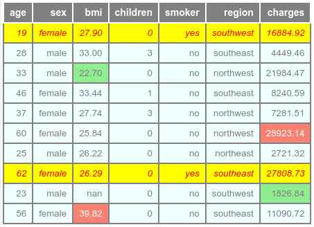
To highlight the entire row for the specific column smoker with the value yes, execute the following:
def is_smoker(row):
  n_cols = len(row)
  return n_cols * ['background-color: yellow; color: red; font-style: italic'] if row['smoker'] == 'yes' else n_cols * ['']

df.head(n_rows).style \
  .format({'bmi': '{:.2f}', 'charges': '{:.2f}'}) \
  .set_properties(**{'background-color': 'azure', 'border': '2.0px solid gray', 'color': 'gray', 'font-size': '10pt'}) \
  .set_table_styles([{'selector': 'th', 'props': [('background-color', 'gray'), ('color', 'white'), ('border', '2.0px solid white')]}]) \
  .hide() \
  .highlight_min(subset=['bmi', 'charges'], color='lightgreen') \
  .highlight_max(subset=['bmi', 'charges'], props='background-color: salmon; color: white') \
  .apply(is_smoker, axis=1)
The following illustration would be the typical output:
This concludes the hands-on demonstration on styling the Pandas DataFrame and note that we have barely scratched the surface !!!
References